Other layouts and widgets
This section introduces other widgets and layouts.
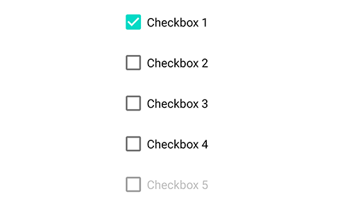
Checkbox widget: checkbox
See Android CheckBox.
checkbox is a check box widget that provides check/uncheck interactions.
text
The label text of the checkbox displayed next to the box. checkbox inherits from text and button, so their attributes also apply (e.g. textSize, textStyle).
checked
Set the checked state. checked="true" means checked; otherwise unchecked. You can also update it dynamically via attr, for example: $ui.checkbox1.attr("checked", "true").
enabled
Whether the checkbox is enabled. If enabled="false", it is disabled (gray) and not interactive.
isChecked()
- Returns {boolean}
Check whether the checkbox is currently checked. Returns true if checked, otherwise false.
Event: check
checked{boolean} Whether it is checkedview{View} The current event's View
Triggered when the user checks or unchecks the checkbox.
"ui";
ui.layout(
  <vertical padding="16">
    <checkbox id="cb1" text="Checkbox" />
    <checkbox id="cb2" checked="true" text="Checked checkbox" />
    <checkbox id="cb3" text="Disabled checkbox" enabled="false" />
  </vertical>,
);

ui.cb1.on("check", (checked) => {
  if (checked) {
    toast("The first one is checked");
  } else {
    toast("The first one is unchecked");
  }
});

// Update cb3 checked state
$ui.cb3.attr("checked", "true");
Radio widget: radio
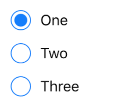
See Android RadioButton.
A radio button allows selecting a single option, usually used with radiogroup.
text
The label text shown next to the radio button. radio inherits from text and button, so their attributes also apply (e.g. textSize, textStyle).
checked
Set the checked state. checked="true" means checked; otherwise unchecked.
enabled
Whether the radio is enabled. If enabled="false", it is disabled (gray) and not interactive.
isChecked()
- Returns {boolean}
Return whether it is checked. Returns true if checked, otherwise false. Example: $ui.radio1.isChecked().
Event: check
checked{boolean} Whether it is checkedview{View} The current event's View
Triggered when the user checks/unchecks the radio.
"ui";

ui.layout(
  <vertical padding="16">
    <radio id="radio1" text="Radio 1" />
    <radio id="radio2" text="Radio 2" />
    <radio id="radio3" text="Checked radio 3" checked="true" />
  </vertical>,
);
// Listen for a single radio's check event
$ui.radio2.on("check", (checked) => {
  if (checked) {
    toastLog("Radio 2 checked");
  } else {
    toastLog("Radio 2 unchecked");
  }
});
Radio group: radiogroup
See Android RadioGroup.
radiogroup provides multiple radio options but the user can select at most one option (mutual exclusion).
checkedButton
Set the initially checked radio id inside the radiogroup. For example checkedButton="@+id/radio5" makes the radio with id radio5 checked initially.
"ui";

$ui.layout(
  <vertical padding="16">
    <radiogroup checkedButton="@+id/radio5">
      <radio id="radio4" text="Radio 4" />
      <radio id="radio5" text="Initially checked radio 5" />
      <radio id="radio6" text="Radio 6" />
    </radiogroup>
  </vertical>,
);
setOnCheckedChangeListener(listener)
- listener {Function} Check-change callback, whose parameters are:
group{RadioGroup} The radiogroup instance that changedcheckedId{number} The checked radio's id as an integer;-1if none is checked
Set a listener for checked changes inside a radiogroup. Note that checkedId is an integer, not an id string like "radio5". You can use findViewById() to get the checked radio widget, for example:
"ui";

$ui.layout(
  <vertical padding="16">
    <radiogroup id="radiogroup1">
      <radio id="radio1" text="Radio 1" />
      <radio id="radio2" text="Radio 2" />
      <radio id="radio3" text="Radio 3" />
    </radiogroup>
  </vertical>,
);

$ui.radiogroup1.setOnCheckedChangeListener((group, checkedId) => {
  // Get checked radio by integer id
  let checkedRadio = $ui.radiogroup1.findViewById(checkedId);
  switch (checkedRadio) {
    case $ui.radio1:
      toastLog("Radio 1 checked");
      break;
    case $ui.radio2:
      toastLog("Radio 2 checked");
      break;
    case $ui.radio3:
      toastLog("Radio 3 checked");
      break;
    default:
      toastLog("No radio is checked");
      break;
  }
});
getCheckedRadioButtonId()
- Returns {number}
Get the integer id of the checked radio inside the radiogroup. If none is checked, returns -1.
Note checkedId is an integer, not an id string like "radio5". You can use findViewById() to get the checked radio.
You can further use indexOfChild to get the checked radio's index inside the radiogroup.
Example:
"ui";

$ui.layout(
  <vertical padding="16">
    <radiogroup id="radiogroup2">
      <radio id="radio4" text="Radio 4" />
      <radio id="radio5" text="Radio 5" />
      <radio id="radio6" text="Radio 6" />
    </radiogroup>
    <button id="get" text="Get current selection" />
  </vertical>,
);

$ui.get.on("click", () => {
  // Get the checked radio id in radiogroup2
  let checkedId = $ui.radiogroup2.getCheckedRadioButtonId();
  if (checkedId === -1) {
    toastLog("No radio is checked");
  } else {
    // Get checked radio by id
    let checkedRadio = $ui.radiogroup2.findViewById(checkedId);
    // Get checked index
    let i = $ui.radiogroup2.indexOfChild(checkedRadio);
    toastLog(
      "Checked radio text: " +
        checkedRadio.getText().toString() +
        ", index: " +
        i,
    );
  }
});
clearCheck()
Clear the checked state of all radio options in the group (reset to “none checked”).
"ui";

$ui.layout(
  <vertical padding="16">
    <checkbox id="cb1" text="Checkbox" />
    <radiogroup id="radiogroup1">
      <radio id="radio1" text="Radio 1" />
      <radio id="radio2" text="Radio 2" />
      <radio id="radio3" text="Radio 3" />
    </radiogroup>
    <button id="clear" text="Clear selection" />
  </vertical>,
);

$ui.clear.on("click", () => {
  // Clear radio selection
  $ui.radiogroup1.clearCheck();
  // Uncheck checkbox
  $ui.cb1.attr("checked", "false");
});
Switch widget: Switch
See Android Switch.
A switch indicates whether an option is enabled.

text
The label text shown next to the switch. Switch inherits from text and button, so their attributes also apply (e.g. textSize, textStyle).
checked
Set whether the switch is on. checked="true" means on.
enabled
Whether the switch is enabled. If enabled="false", it is disabled (gray) and not interactive.
isChecked()
- Returns {boolean}
Return whether the switch is on. For example: $ui.switch1.isChecked().
Event: check
checked{boolean} Whether it is checkedview{View} The current event's View
Triggered when the user toggles the switch.
"ui";

ui.layout(
  <vertical padding="16">
    <Switch id="sw" text="Switch" />
  </vertical>,
);

// Listen for toggle
$ui.sw.on("check", (checked) => {
  if (checked) {
    toastLog("Switch is ON");
  } else {
    toastLog("Switch is OFF");
  }
});
Progress bar widget: progressbar
See Android ProgressBar.
progressbar displays the progress (and possibly percentage) of an operation. By changing its attributes you can adjust how it is rendered. By default it is an indeterminate circular progress indicator.
indeterminate
- {boolean}
Whether it is indeterminate. Defaulttrue. Supported values: trueIndeterminate progressfalseDeterminate progress
progress
- {number}
Progress value as an integer. Default range is 0~100.
min
- {number}
Minimum progress. Default 0.
max
- {number}
Maximum progress. Default 100.
progressDrawable
- {string}
Drawable used to draw the progress bar in determinate mode.
progressBackgroundTint
- {string}
Apply a color to the progress background. Does not change the current tint mode.
progressBackgroundTintMode
- "add" | "multiply" | "screen" | "src_atop" | "src_in" | "src_over"
Apply the tint specified by progressBackgroundTint with the given blending mode.
progressTint
- {string}
Apply a color to the progress drawable. Does not change the current tint mode.
progressTintMode
- "add" | "multiply" | "screen" | "src_atop" | "src_in" | "src_over"
Apply the tint specified by progressTint with the given blending mode.
secondaryProgress
- {number}
Set the secondary progress. If the progressbar is indeterminate, this does nothing.
secondaryProgressTint
- {string}
Apply a tint to secondaryProgress (if present). Does not change the current tint mode.
secondaryProgressTintMode
- "add" | "multiply" | "screen" | "src_atop" | "src_in" | "src_over"
Apply the tint specified by secondaryProgressTint with the given blending mode.
style
- {string}
Set the width/layout style of the progressbar. Supported values:
@style/Base.Widget.AppCompat.ProgressBar.HorizontalHorizontal progress bar@style/Base.Widget.AppCompat.ProgressBarCircular progress bar
Seek bar widget: seekbar
See Android SeekBar.
An adjustable progress bar. Similar to progressbar, but users can drag it to change the value.
seekbar inherits from progressbar, so it supports progressbar attributes as well.
Use setOnSeekBarChangeListener to listen for progress changes, and getProgress to read the current progress.
"ui";

$ui.layout(
  <vertical>
    <seekbar id="seekbar" max="200" />
    <button id="ok" text="OK" />
  </vertical>,
);

$ui.ok.on("click", () => {
  toastLog("Current progress:", $ui.seekbar.getProgress());
});
$ui.seekbar.setOnSeekBarChangeListener({
  onProgressChanged: (seekbar, progress, fromUser) => {
    console.log("Progress: ", progress);
  },
});
Spinner widget: spinner
See Android Spinner.
Tap the dropdown arrow to show multiple options for the user to choose from.
spinnerMode
- {string}
Spinner display mode. Default is dropdown.
dialogUse dialog-mode selection.dropdownUse dropdown-mode selection.
dropDownHorizontalOffset
- {string}
Set the horizontal offset for the dropdown popup. Only works when spinnerMode="dropdown".
dropDownVerticalOffset
- {string}
Set the vertical offset for the dropdown popup. Only works when spinnerMode="dropdown".
dropDownWidth
- {string}
Set the popup width. Only works when spinnerMode="dropdown".
popupBackground
- {string}
Set the popup background. Only works when spinnerMode="dropdown".
prompt
- {string}
Set the prompt text shown when using dialog mode.
textStyle
- {string}
Set the style of the selected item text, e.g. bold, italic.
textColor
- {string}
Set the text color of the currently selected item.
textSize
- {string}
Set the font size of the currently selected item text.
entries
- {string}
The option entries. Use | to separate multiple entries, e.g. entries="Option 1|Option 2|Option 3". You can also update it dynamically, e.g. $ui.spinner.attr("entries", "A|B|C|D").
entryTextStyle
- {string}
Text style for the dropdown entries.
entryTextColor
- {string}
Text color for the dropdown entries.
entryTextSize
- {string}
Font size for the dropdown entries.
Time picker: timePicker
See Android TimePicker.
Users can select any time within 24 hours. Depending on locale/settings it may show AM/PM and hour/minute.
timePickerMode
- {string}
Time picker display mode. If not specified, the default is clock.
spinnerSpinner-style selection.clockClock-style selection.
Date picker: datePicker
See Android DatePicker.
Users can select a date. It may display as "MM/dd/yyyy" and, in calendar mode, may also show the day of week.
datePickerMode
- {string}
Date picker display mode. If not specified, the default is calendar.
spinnerSpinner-style selection.calendarCalendar-style selection.
spinnersShown
- {boolean}
Whether to show the spinner-style date selector.
calendarViewShown
- {boolean}
Whether to show the calendar view.
firstDayOfWeek
- {number}
Set the first day of week. Range 1~7, representing Sunday~Saturday. Default is 1 (Sunday).
maxDate
- {string}
Set the maximum supported date for this datePicker, in format yyyy/MM/dd.
minDate
- {string}
Set the minimum supported date for this datePicker, in format yyyy/MM/dd.
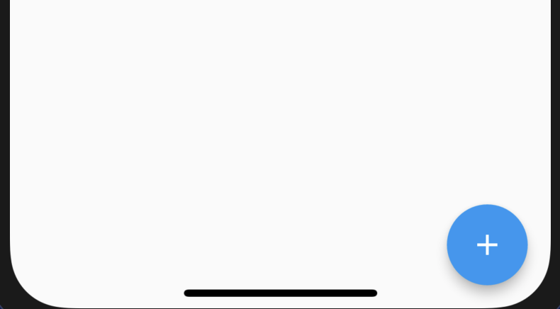
Floating action button: fab
A floating action button (FAB) is a floating icon button in the UI. Its color/icon/position typically stand out to highlight an important action and guide users to perform frequent or primary operations.
src
Set the FAB icon source. Same format as the image widget src, e.g. @drawable/ic_add_black_48dp, https://example.com/icon.png, etc.
Example (FAB at bottom-right):
"ui";

ui.layout(
  <frame>
    <fab
      id="add"
      w="auto"
      h="auto"
      src="@drawable/ic_add_black_48dp"
      margin="16"
      layout_gravity="bottom|right"
      tint="#ffffff"
    />
  </frame>,
);

ui.add.on("click", () => {
  toastLog("FAB clicked");
});
Toolbar widget: toolbar
App toolbar (title bar).
logo
Set a drawable logo for the toolbar.
logoDescription
Set a content description for the toolbar logo.
navigationIcon
Set the content description for the navigation button (if present). This is read by screen readers and other accessibility systems.
popupTheme
Theme to use for the toolbar's popup menus. By default, uses the same theme as the toolbar.
title
Set the toolbar title. The title should serve as an anchor for the content and should describe/name what is being viewed.
titleTextColor
Set toolbar title text color.
titleMargin
Set title margins.
titleMarginBottom
Set bottom title margin.
titleMarginTop
Set top title margin.
titleMarginStart
Set start title margin.
titleMarginEnd
Set end title margin.
subtitle
Set toolbar subtitle.
subtitleTextColor
Set toolbar subtitle text color.
Card: card
Card widget with rounded corners and shadow.
cardBackgroundColor
Card background color. Example: cardBackgroundColor="#ffffff".
cardCornerRadius
Corner radius.
cardElevation
Set the card elevation (z-axis) to control shadow size.
contentPadding
Set content padding. This includes four values:
contentPaddingLeftLeft paddingcontentPaddingRightRight paddingcontentPaddingTopTop paddingcontentPaddingBottomBottom padding
foreground
Use foreground="?selectableItemBackground" to add a click ripple effect to a card.
Drawer layout: drawer
List: list
See Android RecyclerView.
Event: item_click
Triggered when the user clicks an item in a list.
"ui";
$ui.layout(
  <frame>
    <list id="list">
      <vertical>
        <text
          id="name"
          textSize="16sp"
          textColor="#000000"
          text="Name: {{name}}"
        />
        <text
          id="age"
          textSize="16sp"
          textColor="#000000"
          text="Age: {{age}}"
        />
      </vertical>
    </list>
  </frame>,
);
var items = [
  {
    name: "Xiao Ming",
    age: 18,
  },
  {
    name: "Xiao Hong",
    age: 30,
  },
];
$ui.list.setDataSource(items);
$ui.list.on("item_click", function (item, i, itemView, listView) {
  toast("Clicked: " + item.name + ", age: " + item.age);
});
Event: item_click
item{any} Clicked item's datai{number} Clicked item's indexitemView{View} Clicked item's ViewlistView{View} Current list widget
Triggered when the user clicks an item in a list.
"ui";
$ui.layout(
  <frame>
    <list id="list">
      <vertical>
        <text
          id="name"
          textSize="16sp"
          textColor="#000000"
          text="Name: {{name}}"
        />
        <text
          id="age"
          textSize="16sp"
          textColor="#000000"
          text="Age: {{age}}"
        />
      </vertical>
    </list>
  </frame>,
);
var items = [
  {
    name: "Xiao Ming",
    age: 18,
  },
  {
    name: "Xiao Hong",
    age: 30,
  },
];
$ui.list.setDataSource(items);
$ui.list.on("item_click", function (item, i, itemView, listView) {
  toast("Clicked: " + item.name + ", age: " + item.age);
});
Event: item_long_click
event{object} Event object, fields:consumed{boolean} Whether to consume this eventview{View} The View for this event
item{any} Long-clicked item's datai{number} Long-clicked item's indexitemView{View} Long-clicked item's ViewlistView{View} Current list widget
Triggered when the user long-presses an item in a list.
Event: item_bind
itemView{View} Current list item's ViewitemHolder{object} Item holder. Can read the item's position/data dynamically.item{any} Item dataposition{number} Item position
Triggered when the list creates a new list item View. In practice, a list does not create a separate View for every item. For example, if the list has 2000 items and only ~10 can be displayed at once, it will only create around ~10 item Views.
This event is commonly used to set event callbacks on item views, for example:
"ui";
$ui.layout(
  <frame>
    <list id="list">
      <vertical>
        <text
          id="name"
          textSize="16sp"
          textColor="#000000"
          text="Name: {{this.name}}"
        />
        <checkbox id="checkbox" checked="{{this.checked}}" />
      </vertical>
    </list>
  </frame>,
);
var items = [
  {
    name: "Xiao Ming",
    checked: false,
  },
  {
    name: "Xiao Hong",
    checked: false,
  },
];
$ui.list.setDataSource(items);

$ui.list.on("item_bind", function (itemView, itemHolder) {
  itemView.checkbox.on("check", function (checked) {
    let item = itemHolder.item;
    item.checked = checked;
    console.log(item);
  });
});
Event: item_data_bind
itemView{View} Current list item's ViewitemHolder{object} Item holder. Can read the item's position/data.item{any} Item dataposition{number} Item position
Triggered when the list binds item data to an item view.
"ui";
$ui.layout(
  <frame>
    <list id="list">
      <vertical>
        <text
          id="name"
          textSize="16sp"
          textColor="#000000"
          text="Name: {{this.name}}"
        />
        <checkbox id="checkbox" checked="{{this.checked}}" />
      </vertical>
    </list>
  </frame>,
);
var items = [
  {
    name: "Xiao Ming",
    checked: false,
  },
  {
    name: "Xiao Hong",
    checked: false,
  },
];
$ui.list.setDataSource(items);

$ui.list.on("item_data_bind", function (itemView, itemHolder) {
  let item = itemHolder.item;
  itemView.name.setTextColor(item.checked ? $colors.RED : $colors.BLACK);
});

$ui.list.on("item_bind", function (itemView, itemHolder) {
  itemView.checkbox.on("check", function (checked) {
    let item = itemHolder.item;
    item.checked = checked;
    $ui.list.getAdapter().notifyItemChanged(itemHolder.position);
  });
});
Tabs: tab
See Android TabLayout。
Tab layout.
tabGravity
Set the gravity used when laying out tabs. You can also refer to: tabMode vs tabGravity comparison.
tabIndicatorColor
Set the indicator color for the currently selected tab.
tabIndicatorHeight
Set the indicator height for the currently selected tab.
tabMode
Set tab behavior mode. Includes:
fixedFixed tabs show all tabs at once. Best for content that benefits from quick switching between tabs.scrollableScrollable tabs show a subset of tabs at a time and can contain longer labels and more tabs. Best for browsing context without needing to compare all labels at once.
tabTextColor
Set the text color for tabs in normal state.
tabSelectedTextColor
Set the text color for tabs in selected state.
Console: console
The console widget can display logs inside a UI, similar to the built-in Auto.js console.
This console widget only shows logs for the current script. To show logs from all scripts, use global console (see below).
"ui";

$ui.layout(
  <vertical>
    <appbar>
      <toolbar id="toolbar" title="Console in UI" />
    </appbar>
    <console id="console" w="*" h="*" />
  </vertical>,
);

// Set console
$ui.console.setConsole(runtime.console);
// Set input text color
$ui.console.input.setTextColor(colors.BLACK);
// Hide input
$ui.console.setInputEnabled(false);
// Customize log colors
$ui.console.setColor("V", "#bdbdbd");
$ui.console.setColor("D", "#795548");
$ui.console.setColor("I", "#1de9b6");
$ui.console.setColor("W", "#673ab7");
$ui.console.setColor("E", "#b71c1c");
// Customize log font size (sp)
$ui.console.setTextSize(16);
In native mode, the class name is com.stardust.autojs.core.console.ConsoleView.
console.setConsole(con)
con{Console} Console instance
Bind a console instance. After setting, the console widget can display logs. Example: $ui.console.setConsole(runtime.console).
ui.console.setInputEnabled(enabled)
enabled{boolean}
Enable/disable the console input box.
console.getInput()
- Returns
Get the input EditText widget.
console.setColor(level,color)
level{string} Log level:V,D,I,W,E,Acolor{number} | {string} Log color
Set log color.
console.setTextSize(size)
size{number} Font size
Set console log font size in sp.
Global console: globalconsole
Global console reads log files and displays them, typically used for global logs.
In native mode, the class name is com.stardust.autojs.core.console.FileConsoleView.
"ui";

$ui.layout(
  <vertical>
    <appbar>
      <toolbar id="toolbar" title="Console in UI" />
    </appbar>
    <globalconsole id="globalconsole" w="*" h="*" />
  </vertical>,
);

$ui.globalconsole.setColor("D", "#000000");
globalconsole.setColor(level,color)
level{string} Log level:V,D,I,W,E,Acolor{number} | {string} Log color
Set log color.
globalconsole.setLogFile(file)
file{string} Log file path
Set the log file path. If not set, uses the default log file.
globalconsole.clear()
Clear the widget's displayed log content. This does not clear the log file.
To clear the log file contents, delete the log file and then call clear().