Basic layouts and widgets
This page introduces properties and methods shared by all Views, as well as a set of basic widgets and basic layouts.
View
Widgets and layouts are both Views. In this chapter we cover the shared attributes and functions of all widgets and layouts—for example background, width/height (all Views can set these), and functions like click() which set what happens when a View is clicked.
attr(name, value)
name{string} Attribute namevalue{string} Attribute value
Sets an attribute value. The attribute name corresponds to a View's XML attribute. For example, you can call attr("text", "Text") to set the text of a text widget.
"ui";

$ui.layout(
  <frame>
    <text id="example" text="Hello" />
  </frame>,
);

// Run after 5 seconds
$ui.post(() => {
  // Change text
  $ui.example.attr("text", "Hello, Auto.js UI");
  // Change background
  $ui.example.attr("bg", "#ff00ff");
  // Change height
  $ui.example.attr("h", "500dp");
}, 5000);
Warning
Not all attributes can be set from JS. Some attributes can only be set when the layout is created (e.g. style). Others may be theoretically settable but are not yet supported. Unsupported attributes will throw when calling attr().
attr(name)
name{string} Attribute name- Returns {string}
Gets the attribute value.
"ui";

$ui.layout(
  <frame>
    <text id="example" text="1" />
  </frame>,
);

plusOne();

function plusOne() {
  // Get text
  let text = $ui.example.attr("text");
  // Parse to number
  let num = parseInt(text);
  // Add 1
  num++;
  // Set text
  $ui.example.attr("text", String(num));
  // Continue after 1 second
  $ui.post(plusOne, 1000);
}
Warning
attr() returns the value set via attr() or XML attributes. It cannot be used to read runtime values changed by user input, so it is recommended to use widget-specific methods such as getText().
w
The View width. This is a shorthand for the width attribute. Supported values include *, auto, and concrete numbers. * means try to fill the parent; auto adapts to the content. Example:
"ui";
ui.layout(
  <horizontal>
    <button w="auto" text="Auto width" />
    <button w="*" text="Fill parent" />
  </horizontal>,
);
In this example, the first button has auto width and the second fills the parent:
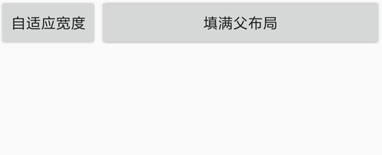
If this attribute is not set, different widgets/layouts have different default widths; most default to auto.
You can also specify a concrete value, e.g. w="20" or w="20px". If you omit the unit, the default unit is dp. Other units include px (pixels), mm (millimeters), and in (inches). For more about units, see Dimension.
"ui";
ui.layout(
  <horizontal>
    <button w="200" text="Width 200dp" />
    <button w="100" text="Width 100dp" />
  </horizontal>,
);
h
The View height. This is a shorthand for the height attribute. Supported values include *, auto, and concrete numbers. * means try to fill the parent; auto adapts to the content.
If this attribute is not set, different widgets/layouts have different default heights; most default to auto.
You can also specify a concrete value, e.g. h="20" or h="20px". If you omit the unit, the default unit is dp. Other units include px (pixels), mm (millimeters), and in (inches). For more about units, see Dimension.
id
The View id. It is used to distinguish different widgets/layouts within the same UI. An id is usually unique within a UI (i.e. you typically won't have two Views with the same id). The id attribute is also the bridge between the XML layout and JavaScript code: in code you can access a View by its id and operate on it (set click actions, set attributes, get attributes, etc.). Example:
"ui";
ui.layout(
  <frame>
    <button id="ok" text="OK" />
  </frame>,
);
// Access the button by id
toast(ui.ok.getText().toString());
In this example, the button text is "OK" and the id is "ok". In code we can access it via ui.ok, then call getText() to get its text. We use a frame layout here because there is only one widget, so a frame is the simplest layout.
gravity
The View "gravity". It controls where the View's content is placed inside the View. Supported values:
leftAlign leftrightAlign righttopAlign topbottomAlign bottomcenterCentercenter_verticalCenter verticallycenter_horizontalCenter horizontally
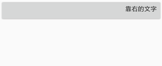
For example, for a button, gravity="right" makes its text align to the right. Example:
"ui";
ui.layout(
  <frame>
    <button gravity="right" w="*" h="auto" text="Right-aligned text" />
  </frame>,
);
Result:
These values can be combined. For example, gravity="right|bottom" places the content at the bottom-right corner.
layout_gravity
The View "layout gravity". It controls where the View itself is placed inside its parent layout. Supported values are the same as gravity. Make sure you don't confuse layout_gravity with gravity.
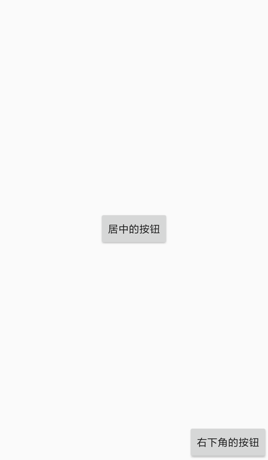
"ui";
ui.layout(
  <frame w="*" h="*">
    <button layout_gravity="center" w="auto" h="auto" text="Centered button" />
    <button
      layout_gravity="right|bottom"
      w="auto"
      h="auto"
      text="Bottom-right button"
    />
  </frame>,
);
In this example, we make the frame fill the whole screen. The first button uses layout_gravity="center" to center itself in the frame; the second uses layout_gravity="right|bottom" to place itself at the bottom-right. Result:
Note that layout_gravity does not always take effect—it depends on the layout type. For example, you cannot make the first child in a horizontal layout stick to the bottom (it conflicts with the nature of a horizontal layout).
margin
margin is the spacing between a View and other Views, i.e. the outer spacing. It includes four sides:
marginLeftLeft marginmarginRightRight marginmarginTopTop marginmarginBottomBottom margin
The margin attribute supports three formats:
margin="marginAll": all sides use the same value. For example,margin="10"means 10dp on all sides.margin="marginLeft marginTop marginRight marginBottom": specify each side. For example,margin="10 20 30 40"means left=10dp, top=20dp, right=30dp, bottom=40dp.margin="marginHorizontal marginVertical": specify horizontal and vertical. For example,margin="10 20"means left/right=10dp, top/bottom=20dp.
Example:
"ui";
ui.layout(
<horizontal>
<button margin="30" text="Margin 30 on all sides" />
<button text="Normal button" />
</horizontal>,
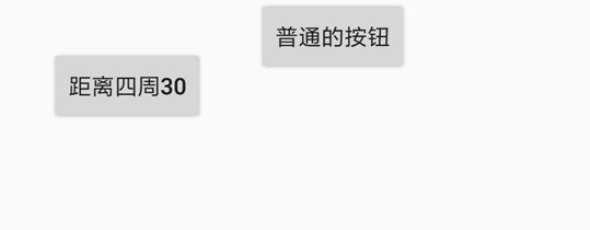
);The first button sets margin="30", so its spacing to the parent horizontal layout and the second button is 30dp. Result:
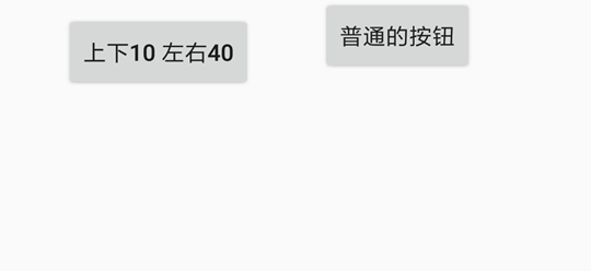
If you change margin="30" to margin="10 40", then left/right spacing is 10dp and top/bottom spacing is 40dp. Result:
For units, see Dimension.
marginLeft
Left margin of the View. If this attribute conflicts with margin, the later attribute wins. For example, margin="20" marginLeft="10" results in left margin 10dp and other sides 20dp.
"ui";
ui.layout(
<horizontal>
<button marginLeft="50" text="50dp from the left" />
<button text="Normal button" />
</horizontal>,
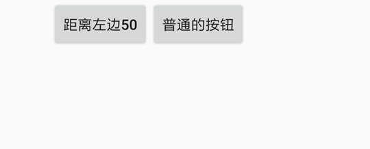
);The first button sets a left margin of 50dp, so it is 50dp away from the left edge of the parent horizontal layout. Result:
marginRight
Right margin of the View. If this attribute conflicts with margin, the later attribute wins.
marginTop
Top margin of the View. If this attribute conflicts with margin, the later attribute wins.
marginBottom
Bottom margin of the View. If this attribute conflicts with margin, the later attribute wins.
padding
The spacing between a View and its own content, i.e. inner padding. Do not confuse it with margin: margin is the spacing between Views, while padding is the spacing between a View and its content. For example, for a TextView, padding is the distance between the widget border and its text content; paddingLeft is the distance between the left edge and the text.
The padding attribute also supports three formats:
padding="paddingAll": all sides use the same value. For example,padding="10"means 10dp on all sides.padding="paddingLeft paddingTop paddingRight paddingBottom": specify each side. For example,padding="10 20 30 40"means left=10dp, top=20dp, right=30dp, bottom=40dp.padding="paddingHorizontal paddingVertical": specify horizontal and vertical. For example,padding="10 20"means left/right=10dp, top/bottom=20dp.
Example:
"ui";
ui.layout(
<frame w="*" h="*" gravity="center">
<text
padding="10 20 30 40"
bg="#ff0000"
w="auto"
h="auto"
text="HelloWorld"
/>
</frame>,
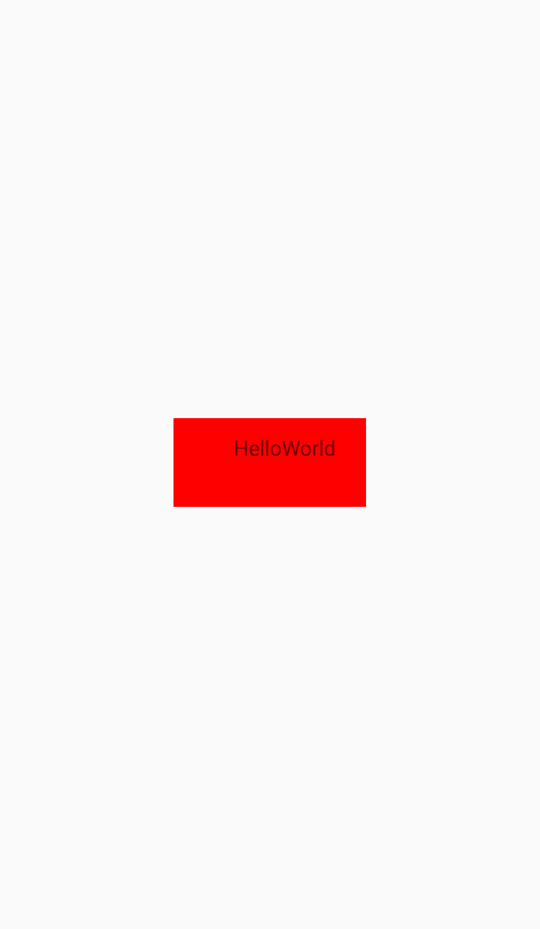
);This example shows a centered text widget (centered by the parent gravity="center"), with red background (bg="#ff0000") and text "HelloWorld". Its padding is left=10dp, top=20dp, right=30dp, bottom=40dp. Result:
paddingLeft
Left padding of the View. If this attribute conflicts with padding, the later attribute wins.
paddingRight
Right padding of the View. If this attribute conflicts with padding, the later attribute wins.
paddingTop
Top padding of the View. If this attribute conflicts with padding, the later attribute wins.
paddingBottom
Bottom padding of the View. If this attribute conflicts with padding, the later attribute wins.
bg
The View background. The value can be an image URL/path, an RGB color, or other drawable backgrounds. See Drawables.
Examples: bg="#00ff00" sets a green background; bg="file:///sdcard/1.png" sets background image "1.png"; bg="?attr/selectableItemBackground" enables a ripple effect on click (you may also need clickable="true").
alpha
View opacity, a float in range 0~1. 0 = fully transparent, 1 = fully opaque. For example, alpha="0.5" means half-transparent.
foreground
The View foreground. A foreground is drawn on top of the View’s content and may cover it. The value is similar to bg.
minHeight
Minimum height of the View. This may not always take effect, depending on whether the parent has enough space.
Example: <text height="auto" minHeight="50"/>
For units, see Dimension.
minWidth
Minimum width of the View. This may not always take effect, depending on whether the parent has enough space.
Example: <input width="auto" minWidth="50"/>
For units, see Dimension.
visibility
View visibility. This attribute controls whether the View is shown. Values:
goneHidden and does not take space.visibleVisible (default).invisibleHidden but still takes space.
rotation
Rotation angle of the View. It rotates the View clockwise by the given degrees. For example, rotation="90" rotates it 90 degrees clockwise.
To set the rotation pivot, use transformPivotX and transformPivotY. The default pivot is the View center.
transformPivotX
Pivot X for transforms. Used as the center for rotation, scaling, etc. Example: transformPivotX="10".
The coordinate system uses the View’s top-left corner as origin. So X is the distance from the View’s left edge to the pivot point.
For units, see Dimension.
transformPivotY
Pivot Y for transforms. Used as the center for rotation, scaling, etc. Example: transformPivotY="10".
The coordinate system uses the View’s top-left corner as origin. So Y is the distance from the View’s top edge to the pivot point.
For units, see Dimension.
style
Sets the View style. Different widgets provide different built-in styles. See each widget’s documentation for details.
Note: the style attribute is only supported on Android 5.1 and above.
Event: click
Triggered when the user clicks the View.
"ui";
$ui.layout(
  <vertical padding="16">
    <button id="click_me" text="Click me" w="auto" />
  </vertical>,
);

$ui.click_me.on("click", () => {
  toast("Clicked");
});
Event: long_click
- event {object} Event object fields:
consumed{boolean} Whether the event is consumedview{View} The View associated with this event
Triggered when the user long-presses the View.
"ui";
$ui.layout(
  <vertical padding="16">
    <button id="click_me" text="Click me" w="auto" />
  </vertical>,
);
$ui.click_me.on("long_click", (event) => {
  toast("Long pressed");
  // Consume event
  event.consumed = true;
});
Event: check
checked{boolean} Whether it is checkedview{View} Current View of the event
Triggered when the user checks/unchecks a checkbox-like widget. Only widgets like Switch, checkbox, and radio have this event.
"ui";
$ui.layout(
  <vertical padding="16">
    <checkbox id="cb1" text="Checkbox" />
  </vertical>,
);
$ui.cb1.on("check", (checked) => {
  if (checked) {
    toast("Checked");
  } else {
    toast("Unchecked");
  }
});
Text widget: text
See Android TextView.
The text widget is used to display text. You can control font size, font color, typeface, etc.
Below are the main attributes and methods. For the full set, see TextView.
text
Sets the text content. Example: text="Some text".
textColor
Sets the text color. It can be an RGB color (e.g. #ff00ff) or a color name (e.g. red, green). See Colors.
Example (red text): <text text="Red text" textColor="red"/>
textSize
Sets text size. The unit is usually sp. In Material Design guidelines, body text is typically 14sp, titles 18sp, and subtitles 16sp.
Example (very large text): <text text="Very large text" textSize="40sp"/>
textStyle
Sets text style (italic, bold, etc.). Supported values:
- bold Bold
- italic Italic
- normal Normal
You can combine them with |, e.g. "bold|italic" for bold italic.
Example (bold): (see TextView docs for textStyle usage).
lines
Sets the number of lines for the text widget. Even if the content has fewer lines, the widget still reserves space for the given line count. If the content exceeds the line count, the extra part will not be shown.
Also note: you generally can't write multi-line text directly in XML; set it in code instead. Example:
"ui";
ui.layout(
  <vertical>
    <text id="myText" line="3" />
  </vertical>,
);
// Use "\n" to insert line breaks
ui.myText.setText("Line 1\nLine 2\nLine 3\nLine 4");
maxLines
Sets the maximum number of lines for the text widget.
typeface
Sets the typeface. Supported values:
normalNormalsansSans-serifserifSerifmonospaceMonospace
Example (monospace): <text text="Monospace" typeface="monospace"/>
ellipsize
Sets the ellipsis position. The ellipsis appears when the text content overflows the widget. Supported values:
endShow ellipsis at the endmarqueeMarquee scrolling effectmiddleShow ellipsis in the middlenoneNo ellipsisstartShow ellipsis at the start
ems
When set, TextView limits the displayed character width (in em). Overflow is hidden or shown with ellipsis depending on ellipsize.
Example: limit to 5em (see TextView docs for ems).
autoLink
Controls whether URLs, email addresses, etc. are automatically detected and converted into clickable links. Default is "none".
When enabled, links/phone numbers inside the text become clickable.
Supported values (can be combined with |):
allMatch all (links, email, address, phone)emailEmail addressesmapMap addressesnoneNone (default)phonePhone numberswebURLs
Example: <text autoLink="web|phone" text="Search: http://www.baidu.com Phone: 10000"/>
Button widget: button
See Android Button.
The button widget is a specialized text widget, so all text widget attributes and methods also apply to buttons.
In addition, buttons have some built-in styles that you can set via style, including:
- Widget.AppCompat.Button.Colored Colored button
- Widget.AppCompat.Button.Borderless Borderless button
- Widget.AppCompat.Button.Borderless.Colored Colored borderless button
See the built-in example "Examples/UI widgets/Button widget.js" for the visual effects of these styles.
Example: <button style="Widget.AppCompat.Button.Colored" text="Nice button"/>
Input widget: input
See Android EditText.
The input widget is also a specialized text widget, so most text widget attributes and methods apply. Inputs also have their own attributes/methods; for the full list see EditText.
For an input widget, you can use the text attribute to set its content, and lines to specify the number of lines. In code, use getText() to read the user input. Example:
"ui";
ui.layout(
  <vertical padding="16">
    <text textSize="16sp" textColor="black" text="Please enter your name" />
    <input id="name" text="Xiao Ming" />
    <button id="ok" text="OK" />
  </vertical>,
);
// Set the action when the OK button is clicked
ui.ok.click(function () {
  // Read input via getText()
  var name = ui.name.getText().toString();
  toast("Hello, " + name + "!");
});
In addition, inputs have some commonly-used attributes (some also exist on text widgets, but are mainly used for inputs):
hint
Hint text. Shown when the input is empty.
Code for the screenshot above:
"ui";
ui.layout(
  <vertical>
    <input hint="Please enter your name" />
  </vertical>,
);
textColorHint
Hint text color.
textSizeHint
Hint text size.
inputType
Specifies the type of text the input can accept. Supported values (and combinations with |):
dateDatedatetimeDate and timenoneNo content type (not editable)numberNumbers onlynumberDecimalCombine withnumberto allow decimalsnumberPasswordNumeric passwordnumberSignedCombine withnumberto allow signed numbersphonePhone numbertextPlain texttextAutoCompleteCombine withtextto enable auto-complete and IME interactiontextAutoCorrectCombine withtextto request auto-correctiontextCapCharactersCombine withtextto capitalize all characterstextCapSentencesCombine withtextto capitalize the first character of each sentencetextCapWordsCombine withtextto capitalize the first character of each wordtextEmailAddressEmail addresstextEmailSubjectEmail subjecttextImeMultiLineCombine withtextto allow multi-line IME input when possibletextLongMessageLong message bodytextMultiLineCombine withtextto allow multiple lines (otherwise single line)textNoSuggestionsCombine withtextto disable dictionary suggestionstextPasswordPasswordtextPersonNamePerson nametextPhoneticPhonetic text (e.g. contact phonetic fields)textPostalAddressPostal addresstextShortMessageShort message contenttextUriURItextVisiblePasswordVisible passwordtextWebEditTextText in web formstextWebEmailAddressEmail address in web formstextWebPasswordPassword in web formstimeTime
Example: to allow decimal numbers: <input inputType="number|numberDecimal"/>
password
Whether the input is a password field. Default false.
Example: <input password="true"/>
numeric
Whether the input is numeric. Default false.
Example: <input numeric="true"/>
phoneNumber
Whether the input is a phone-number field. Default false.
Example: <input phoneNumber="true"/>
digit
Specifies allowed characters. For example, to only allow "1234567890+-": <input digit="1234567890+-"/>.
singleLine
Whether the input is a single-line input. Default false. You can also specify single-line behavior via lines="1".
Example: <input singleLine="true"/>
Image widget: img
See Android ImageView。
The image widget displays images from the web, local storage, or embedded data, and can render them as rounded-rectangles, circles, etc. It cannot display animated GIFs.
Only the main attributes/methods are introduced here. For the full set, see ImageView.
src
Specifies the image source URI. It can be an image URL (http://...), a local path (file://...), or Base64 data ("data:image/png;base64,...").
When using an image URL or local path, Auto.js automatically uses caching to store images and reduce subsequent load time.
Example: display Baidu's logo.
"ui";
ui.layout(
  <frame>
    <img src="https://www.baidu.com/img/bd_logo1.png" />
  </frame>,
);
Another example: display /sdcard/1.png via <img src="file:///sdcard/1.png"/>. Another example: display a small wallet icon via Base64:
"ui";
ui.layout(
  <frame>
    <img
      w="40"
      h="40"
      src="data:image/png;base64,iVBORw0KGgoAAAANSUhEUgAAADwAAAA8CAYAAAA6/NlyAAAACXBIWXMAAA7EAAAOxAGVKw4bAAAEu0lEQVRoge3bW4iVVRQH8N+ZnDKxvJUGCSWUlXYle/ChiKAkIiu7UXQjonwNIopM8cHoAhkRGQXdfIiE0Ep8KalQoptRTiFFZiRlOo6TPuSk4zk97G9w5vidc77LPjNi84f1MN+391rrf9a+rL32N4xiFMcUjouo5zyciYPYH0FnBadiNiZiD2oR9JbGRdgiOFPDIXRhCWYU0Dcj6duV6BrQuyWxNaLowBcOO1Uv+7EKc4WINUIlabMq6dNI35eJzRHDWOzS2MEB6cd6XI/OQf07k2frkzat9HQnNkcUG7R2dECq2I53EtmePMvaf+MwcWqKu+RzuqhUcfcwcWqKTvmiXFQ2GDodRhQz0aN9ZHsSG0cVrkGf+GT7MG8YeeTCHeKS7sOdMR1stjcWxY2YH0nXh1gdSdf/E+2I8KVYigkl9ewVUsxNpT1qMzaKN4ejJxrtyEt7IuraE1EX2jOkp+JBnFxSzz68KuTqoyiK2BHuxDO4NpK+j/GoOAWF6BiH98Q/SHyCycPIIxMm4FPZCPTj30SynIFr+A7ThotMK4wXopA1Ym9gSiKv5Oj3bdKnFMpuS514E1fm6NMnbF098s3NS4QS0Ik5+hyBsoSXYkGO9jvxy6C/t+IPIYJZcBWW57AXFfMNrSo2kqqw2l4hvSzcIRTw1sm24FVxb5s4NcR0/JXBuUNYJttI6sDjsi1kvTgrGpsMjq3O4FQNa+SbNhWsyKj7I4wpzSYDbpFtKB/EOSn9ZwpRfx5Xp7yfhN0Z9FdxXxxKjTEe2zI4U8NnKf3PNrT2VcWTKe1eyGjjT+Eapm14IqMjNTyd0n9JSrsDwhmaEN2H8GMOO8viUjyMSfJVJh9O0bGoQdt1eFm2oVwve7UpC1ssX568KEXH6fghp54s8lRkrk7CjpxOrGqg6wQ8IKSKWXPpVtIt8ly+v4ATf2t+yqlgDl5SbCjXy8JIXFXweQEHqngxo43JeEw54l+JVLKaJeypRZzoFxavrIWG6cKPW2SO9+PCMkQHsLiA8fpIv5/DmUn4qaCtpWWIEiLzdUHj9XJA2H5uFRbBZriuoI1NSpatpio+nJtFvFvYd2c1sDsGvxfQ3a/knrwgMtm0qD8rPSprCuq8uRmhVqvanBbvm+EQfsNKIcnvTmnTiUdwQcq73oJ2L2v2stXx6vyCRr8RDuk/C8OMUK24J6VtBaekPG81zxuh0TTJhC7FhtUOHF+n61whGalvu8uRWVJFvgPEYOkqQzhLVSPPXLoYa4Xh3Stcls1NaTdb8Xx7ZxnCvSUIfy/kzWno0Pyzx3dL2C0695Hto7NGUhXy5Lzp3kLZKiqNpNTl2+YShgdIvyXbVck44TB/oKTNzWUIv13S+IDsFmpY84QvZAcwTbh4e04o18SwtbIM4dsiOTFYVgzSv7wN+m9vRqjV/PrA0JuCox1bhYNKQ7Qi3CcU1fpiedRG9AkLXhRfbxCnKlET0s21ifwaSWcPbopBdDDOwGtClTD2vCsq+/C68K8HmVDk7DhFyIsvFzKnGThN+689+oU9dptwQb5B+LB8dx4lMb7xqAhkJwo/xljhFFSfSdUc3mPrcbwj15P+pP0/QiR7hYSkGsHnUYziWMF/mXV4JVcZ8G0AAAAASUVORK5CYII="
    />
  </frame>,
);
tint
Image tint. The value is a color name or an RGB color value. It paints all non-transparent pixels with the same color, which can be used to change the icon color.
For example, for the Base64 image above, <img w="40" h="40" tint="red" src="data:image/png;base64,..."/> makes the wallet icon red.
scaleType
Controls how the image is scaled within the ImageView. Supported values:
centerCenter the image without scaling.centerCropScale while preserving aspect ratio so that both dimensions are equal to or larger than the corresponding view dimensions (excluding padding), then center-crop.centerInsideScale while preserving aspect ratio so that both dimensions are smaller than the view dimensions (excluding padding), then center.fitCenterScale while preserving aspect ratio so that either width or height matches the view, then center.fitEndSame asfitCenter, but align to bottom-right.fitStartSame asfitCenter, but align to top-left.fitXYScale to exactly match the view width/height; aspect ratio may not be preserved.matrixScale using an image matrix. Requires callingsetImageMatrix(Matrix)in code.
Default scaleType is fitCenter. Another commonly used value is fitXY, which scales the image to the view size but may distort it.
radius
Corner radius for the image widget. If set to half of the view size and the view is square, the image is clipped as a circle. Otherwise it is rendered as a rounded rectangle. You can also set per-corner radii via radiusTopLeft, radiusTopRight, radiusBottomLeft, radiusBottomRight, etc.
Example (rounded Auto.js icon): <img w="100" h="100" radius="20" bg="white" src="http://www.autojs.org/assets/uploads/profile/3-profileavatar.png" />
For units, see Dimension.
radiusTopLeft
Top-left corner radius. For units, see Dimension.
radiusTopRight
Top-right corner radius. For units, see Dimension.
radiusBottomLeft
Bottom-left corner radius. For units, see Dimension.
radiusBottomRight
Bottom-right corner radius. For units, see Dimension.
borderWidth
Border width. Displays a border around the image; it follows the widget shape (rounded corners, etc.). Example (rounded icon with gray border): <img w="100" h="100" radius="20" borderWidth="5" borderColor="gray" bg="white" src="http://www.autojs.org/assets/uploads/profile/3-profileavatar.png" />
borderColor
Border color.
circle
Whether to clip the image as a circle. If true, the widget will keep width and height equal (if not equal, it makes height equal to width) and uses half of the width as the circle radius.
Example (circular Auto.js icon): <img w="100" h="100" circle="true" bg="white" src="http://www.autojs.org/assets/uploads/profile/3-profileavatar.png" />
Vertical layout: vertical
Vertical layout is a simple layout that arranges its child widgets from top to bottom:
Vertical layout:
—————
| Widget 1 |
| Widget 2 |
| Widget 3 |
| ............ |
——————
layout_weight
In a vertical layout, you can use layout_weight to control how much height a child takes relative to the parent. If a child has layout_weight, then:
[
\text{childHeight} = \text{remainingHeight} \times \frac{\text{layout_weight}}{\text{weightSum}}
]
If weightSum is not specified, it defaults to the sum of all children’s layout_weight. “Remaining height” means the parent height minus the heights of children that do not specify layout_weight. Example:
"ui";
ui.layout(
  <vertical h="100dp">
    <text layout_weight="1" text="Widget 1" bg="#ff0000" />
    <text layout_weight="1" text="Widget 2" bg="#00ff00" />
    <text layout_weight="1" text="Widget 3" bg="#0000ff" />
  </vertical>,
);
In this layout, all three children have layout_weight=1, so each takes 1/3 of the parent height, i.e. about 33.3dp. Another example:
"ui";
ui.layout(
  <vertical h="100dp">
    <text layout_weight="1" text="Widget 1" bg="#ff0000" />
    <text layout_weight="2" text="Widget 2" bg="#00ff00" />
    <text layout_weight="1" text="Widget 3" bg="#0000ff" />
  </vertical>,
);
Here, the first child is 1/4, the second is 2/4, and the third is 1/4. Another example:
"ui";
ui.layout(
  <vertical h="100dp" weightSum="5">
    <text layout_weight="1" text="Widget 1" bg="#ff0000" />
    <text layout_weight="2" text="Widget 2" bg="#00ff00" />
    <text layout_weight="1" text="Widget 3" bg="#0000ff" />
  </vertical>,
);
Because weightSum is set to 5, the heights become 1/5, 2/5, and 1/5. Another example:
"ui";
ui.layout(
  <vertical h="100dp">
    <text h="40dp" text="Widget 1" bg="#ff0000" />
    <text layout_weight="2" text="Widget 2" bg="#00ff00" />
    <text layout_weight="1" text="Widget 3" bg="#0000ff" />
  </vertical>,
);
In this layout, the first child has a fixed height of 40dp and does not participate in weight distribution, so the remaining height is 60dp. The second child gets 2/3 of 60dp (40dp), and the third gets 1/3 of 60dp (20dp).
layout_weight can also be used to make a child fill the remaining space. For example:
"ui";
ui.layout(
  <vertical h="100dp">
    <text h="40dp" text="Widget 1" bg="#ff0000" />
    <text h="40dp" text="Widget 2" bg="#00ff00" />
    <text layout_weight="1" text="Widget 3" bg="#0000ff" />
  </vertical>,
);
Here, the third child fills all remaining space after Widget 1 and Widget 2.
Horizontal layout: horizontal
Horizontal layout is a simple layout that arranges its child widgets from left to right:
Horizontal layout:
————————————————————————————
| Widget 1 | Widget 2 | Widget 3 | ... |
————————————————————————————
layout_weight
In a horizontal layout, layout_weight controls the width ratio of children. It works the same way as in vertical layout.
Linear layout: linear
See Android LinearLayout.
In practice, vertical and horizontal are both linear layouts. Linear layout has an orientation attribute to specify the direction: vertical or horizontal.
For example, <linear orientation="vertical"></linear> is equivalent to <vertical></vertical>.
The default orientation is horizontal, so a <linear> without orientation is a horizontal layout.
Frame layout: frame
See Android FrameLayout.
Frame layout is the simplest layout. It positions children starting from the container’s top-left corner (0,0). Multiple children are stacked; later children may cover earlier ones.
gravity
Sets the default gravity for the container. Default is top-left. For example, gravity="center" makes children center by default. See View.gravity for details.
You can use layout_gravity to control child gravity individually. See View.layout_gravity.
"ui";

$ui.layout(
  // Set foreground image and its position
  <frame
    gravity="left|top"
    foreground="@drawable/ic_android_black_48dp"
    foregroundGravity="right|bottom"
  >
    <img w="*" h="*" />
    // Overlay text widgets with different sizes/background colors
    <text w="300dp" h="300dp" background="#2F2F4F" />
    <text w="200dp" h="200dp" background="#FF1CAE" />
    <text w="100dp" h="100dp" background="#6B4226" />
  </frame>,
);
foreground
Sets the frame’s foreground. The foreground is always drawn on top and won’t be covered by children. foreground accepts values similar to bg (colors, image paths, etc.). See bg.
foregroundGravity
Sets where the foreground is placed. Same value set as gravity.
Relative layout: relative
See Android RelativeLayout.
Relative layout positions children based on the parent container and sibling widgets.
Positioning relative to the parent
In a relative layout, you can position a widget relative to its parent.
————— ————— ————— ————— ————— —————
| Widget 1: top-left | | Widget 4: top-center | | Widget 7: top-right |
| Widget 2: center-left | | Widget 5: center | | Widget 8: center-right |
| Widget 3: bottom-left | | Widget 6: bottom-center | | Widget 9: bottom-right |
————— ————— ————— ————— ————— —————
Parent-based attributes:
layout_alignParentLeft="true"Align to the parent's left edge.layout_alignParentRight="true"Align to the parent's right edge.layout_alignParentTop="true"Align to the parent's top edge.layout_alignParentBottom="true"Align to the parent's bottom edge.layout_centerHorizontal="true"Center horizontally in the parent.layout_centerVertical="true"Center vertically in the parent.layout_centerInParent="true"Center both horizontally and vertically in the parent.
By combining these attributes, you can place a widget at top-left, top-right, bottom-left, bottom-right, top-center, bottom-center, center-left, center-right, or center. For example, using layout_alignParentLeft="true" and layout_alignParentBottom="true" places the widget at the parent's bottom-left.
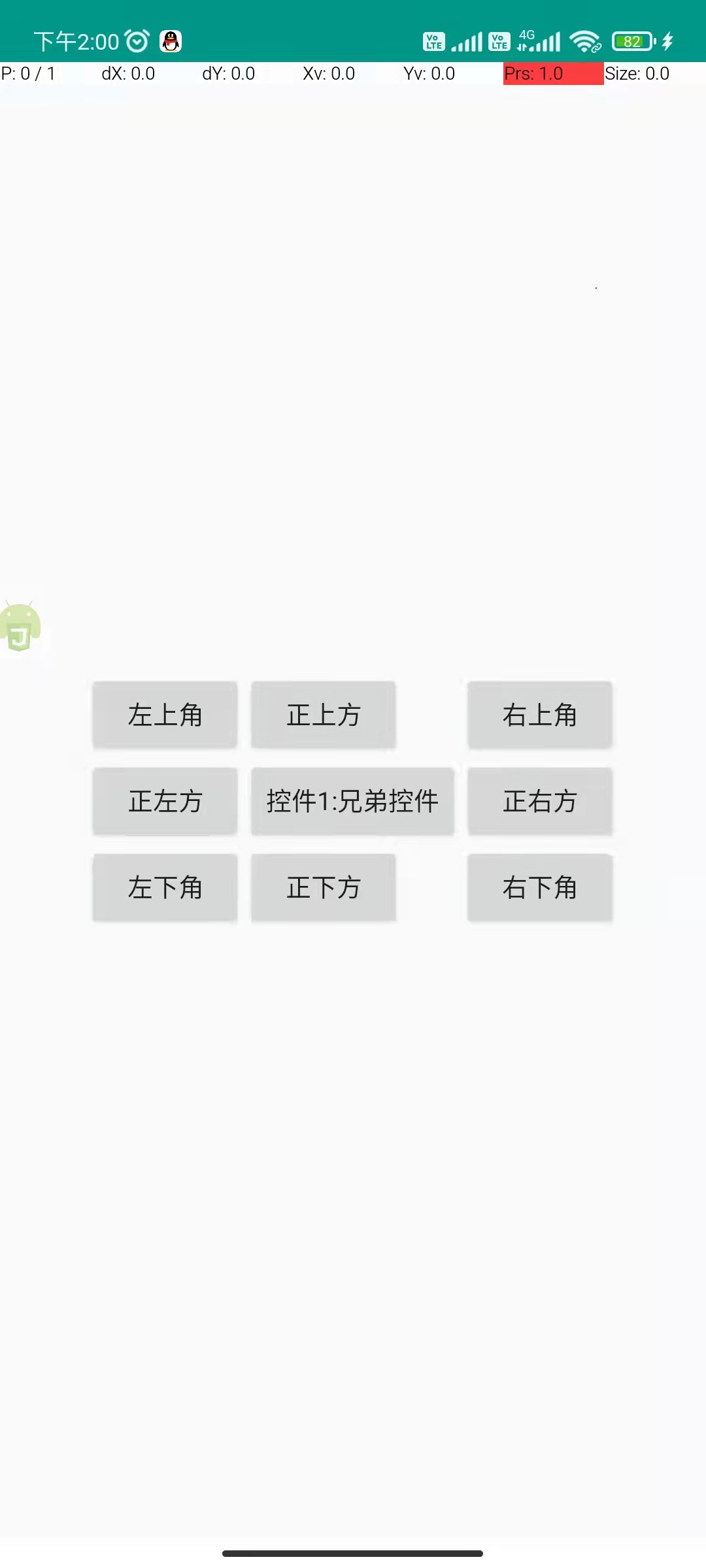
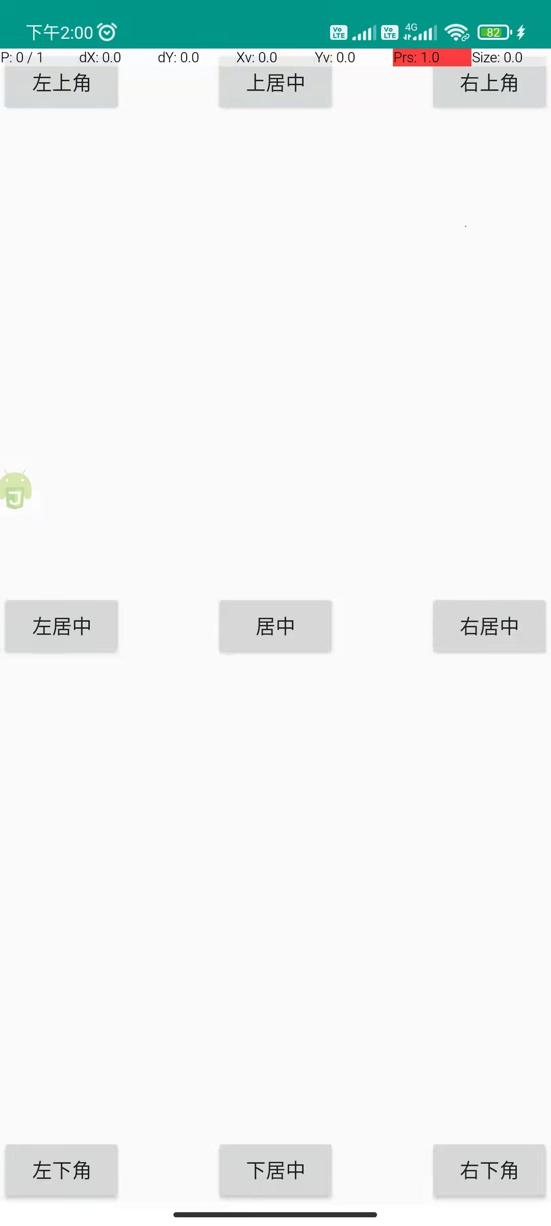
Example:
"ui";

$ui.layout(
  <relative>
    <button text="Center" layout_centerInParent="true" />
    <button
      text="Top-left"
      layout_alignParentLeft="true"
      layout_alignParentTop="true"
    />
    <button
      text="Top-right"
      layout_alignParentRight="true"
      layout_alignParentTop="true"
    />
    <button
      text="Bottom-left"
      layout_alignParentLeft="true"
      layout_alignParentBottom="true"
    />
    <button
      text="Bottom-right"
      layout_alignParentRight="true"
      layout_alignParentBottom="true"
    />
    <button
      text="Top-center"
      layout_alignParentTop="true"
      layout_centerHorizontal="true"
    />
    <button
      text="Bottom-center"
      layout_alignParentBottom="true"
      layout_centerHorizontal="true"
    />
    <button
      text="Center-left"
      layout_alignParentLeft="true"
      layout_centerVertical="true"
    />
    <button
      text="Center-right"
      layout_alignParentRight="true"
      layout_centerVertical="true"
    />
  </relative>,
);
Positioning relative to siblings
In a relative layout, you can also position a widget relative to a sibling (a widget whose position is already determined).
————— ————— ————— ————— ————— —————
| Widget 2: top-left | | Widget 5: above | | Widget 7: top-right |
| Widget 3: left | | Widget 1: reference | | Widget 8: right |
| Widget 4: bottom-left | | Widget 6: below | | Widget 9: bottom-right |
————— ————— ————— ————— ————— —————
Sibling-based attributes (relative to button1):
layout_toLeftOf="@+id/button1"Place the widget to the left ofbutton1.layout_toRightOf="@+id/button1"Place the widget to the right ofbutton1.layout_above="@+id/button1"Place the widget abovebutton1.layout_below="@+id/button1"Place the widget belowbutton1.layout_alignLeft="@+id/button1"Align the left edge withbutton1.layout_alignRight="@+id/button1"Align the right edge withbutton1.layout_alignTop="@+id/button1"Align the top edge withbutton1.layout_alignBottom="@+id/button1"Align the bottom edge withbutton1.
By combining these attributes, you can place a widget at the sibling's top-left, top-right, bottom-left, bottom-right, above, below, left, right, etc. For example, layout_toRightOf="@+id/button1" + layout_above="@+id/button1" places the widget at the top-right of the reference widget (their right edges align).
Example (sibling-based positioning):
"ui";

$ui.layout(
  <relative>
    <button id="button1" text="Widget 1 (reference)" layout_centerInParent="true" />
    <button
      text="Top-left"
      layout_above="@+id/button1"
      layout_toLeftOf="@+id/button1"
    />
    <button
      text="Top-right"
      layout_above="@+id/button1"
      layout_toRightOf="@+id/button1"
    />
    <button
      text="Bottom-left"
      layout_below="@+id/button1"
      layout_toLeftOf="@+id/button1"
    />
    <button
      text="Above"
      layout_above="@+id/button1"
      layout_alignLeft="@+id/button1"
    />
    <button
      text="Below"
      layout_below="@+id/button1"
      layout_alignLeft="@+id/button1"
    />
    <button
      text="Bottom-right"
      layout_toRightOf="@+id/button1"
      layout_below="@+id/button1"
    />
    <button
      text="Left"
      layout_alignTop="@+id/button1"
      layout_toLeftOf="@+id/button1"
    />
    <button
      text="Right"
      layout_toRightOf="@+id/button1"
      layout_alignTop="@+id/button1"
    />
  </relative>,
);